Milk Stork

We developed a brand strategy with the goals of normalizing breastfeeding and pumping, empowering working moms, and creating a safe place in which real women share personal experiences.
WHAT WE DID
Brand Strategy
Brand Identity
Website
Marketing Plan
Art Direction
Content Creation
Packaging & Collateral
Being a mom is the best, hardest job in the world. Forty-two percent of moms are their household’s sole or primary breadwinner, but over half of new moms find themselves back at work months before they’re emotionally and physically ready. Career-driven moms shouldn’t have to choose between putting their babies’ nutrition first and going back to work, but many don’t have a choice. With breast milk shipping as its service offering, Milk Stork set out on a mission to empower breastfeeding moms by eliminating societal barriers of pumping while traveling. With such an ingenious service, we developed a powerful, supportive, and empathetic voice, and a brand identity that is worthy of the most inspiring influencers on the planet: moms.
BRAND STATEGY
FOR MOMS ON A MISSION
Milk Stork makes shipping breast milk easy so working moms can take care of business.
We steered Milk Stork away from the typical, expected “baby” themes and colors and toward bolder, more empowering colors, fonts, imagery, and design principles. We gave it a much more premium look and feel, with a matching powerful, supportive, and empathetic tone worthy of the brand’s target audience—working, traveling, incredibly multidimensional moms. The logo was slightly updated with new font that has simple geometric forms and even strokes to define a clean and distinctive look. Modest and unpretentious, yet bold and daring. The stork was placed over the i to add a playful element.
Brand Identity
LOGOS
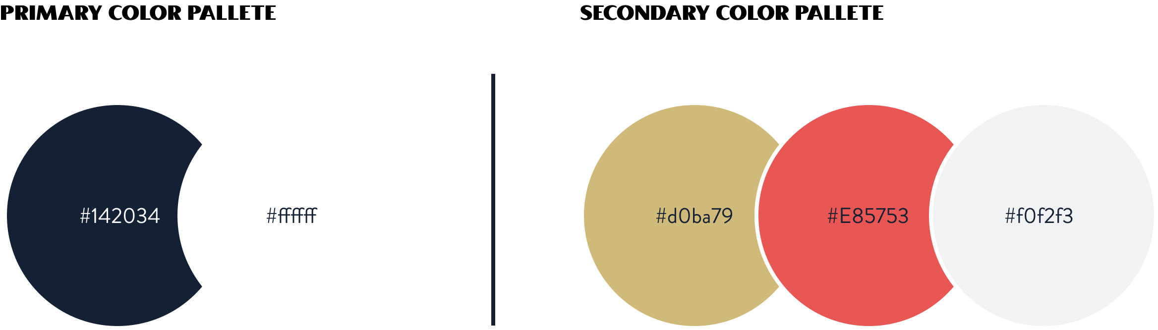
COLORS
Coral paired with navy, gold, and white feels very approachable yet premium. Navy and white are the primary colors; gold, coral, and gray are the accent colors.

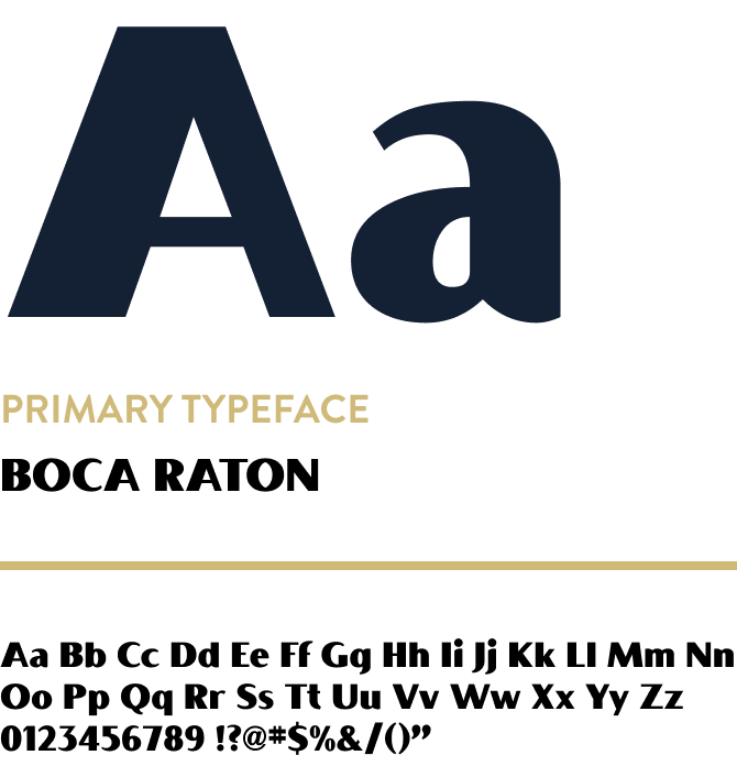
FONTS
Boca Raton has unique letterforms that are very approachable. Paired with the geometric nature of Brandon Grotesque, the combination of these two typefaces provides a friendly, warm, and welcoming touch. Both have interesting characteristics that make them very professional and modern. Lato is used as a web font in order to optimize for search.
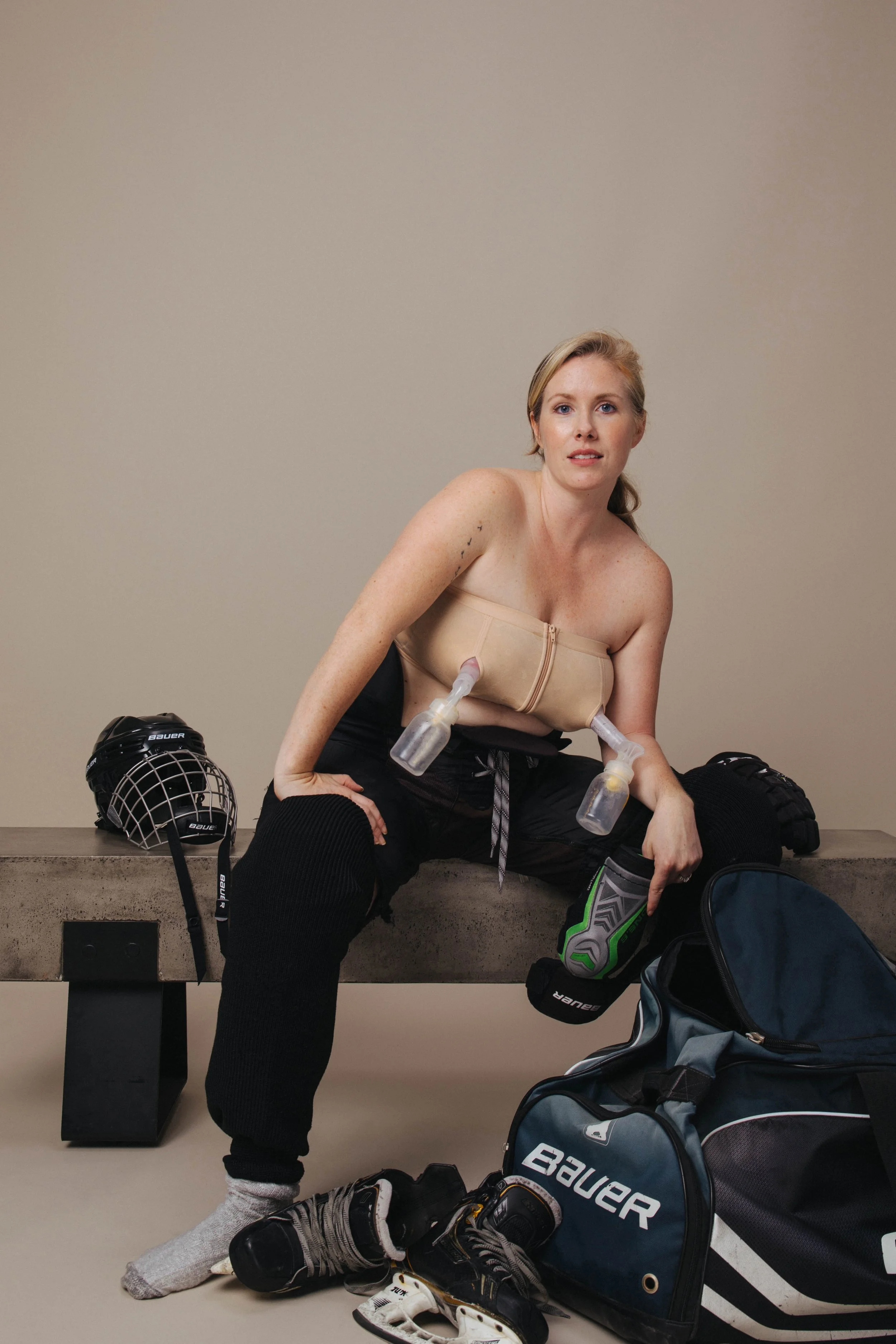
With the insight that most moms feel put in a box by advertisers, we art directed a photoshoot that captured the powerful essence of the modern-day mom. This mom is not only working while raising children, but she has interests outside her home and work life.
PHOTOGRAPHY
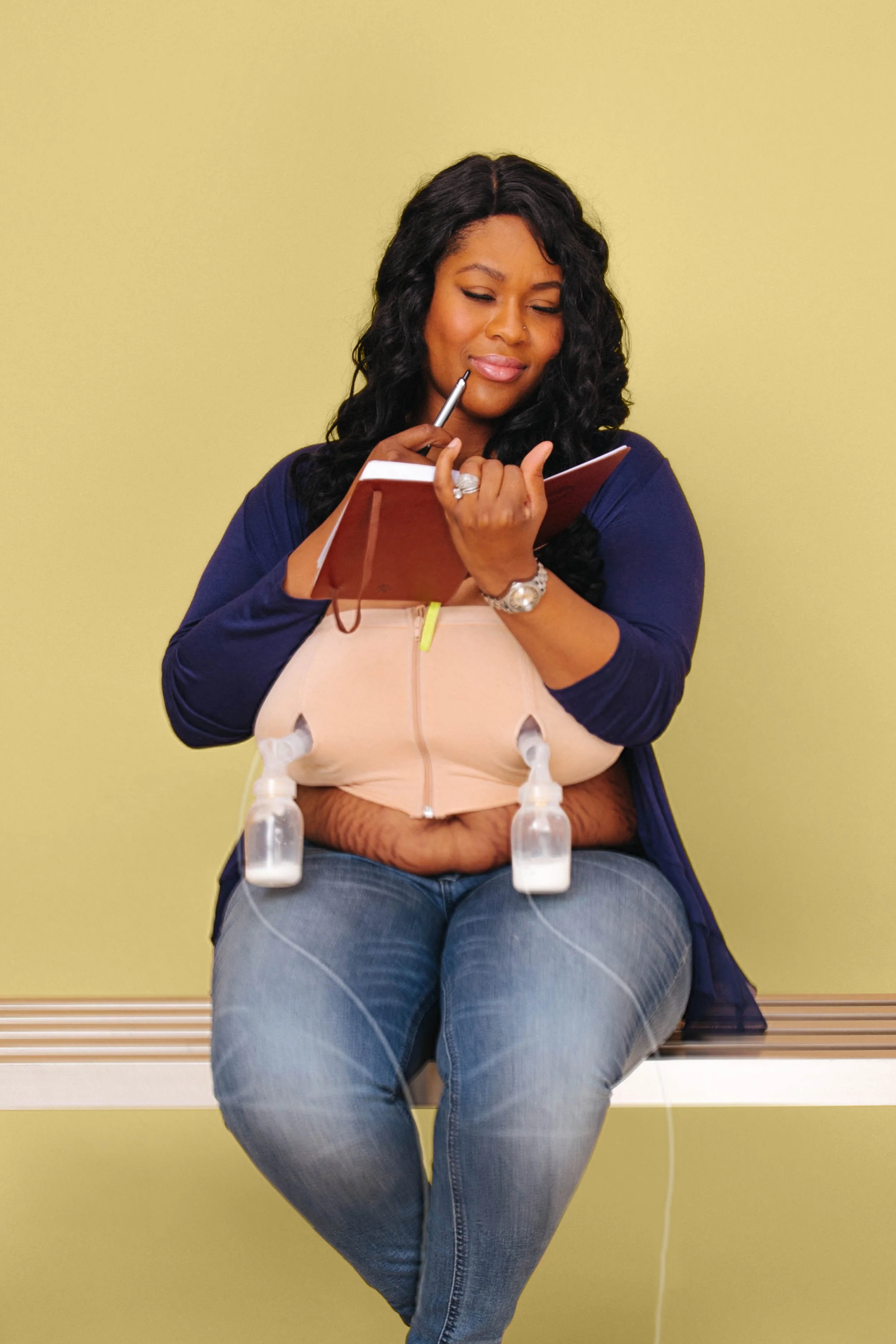

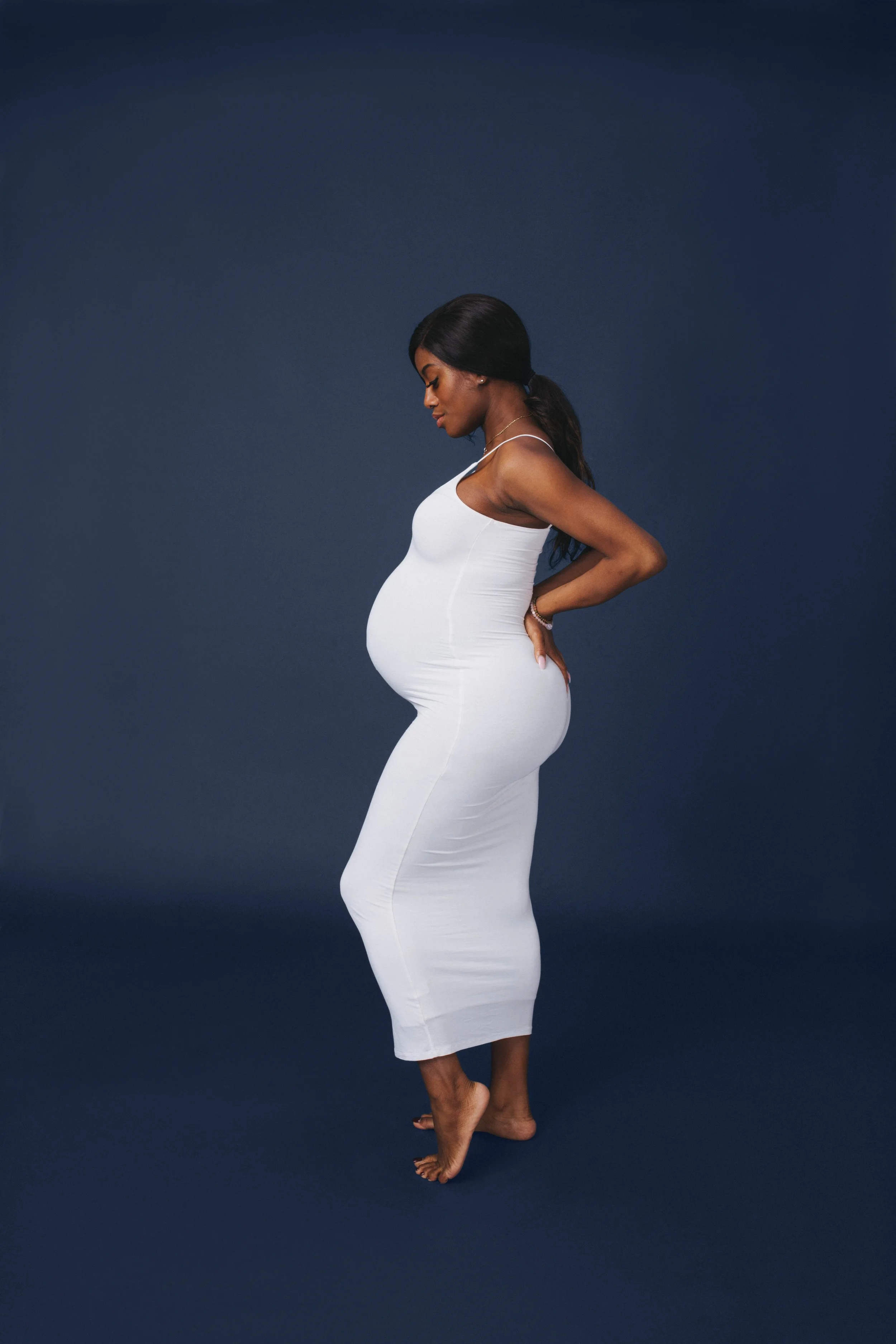
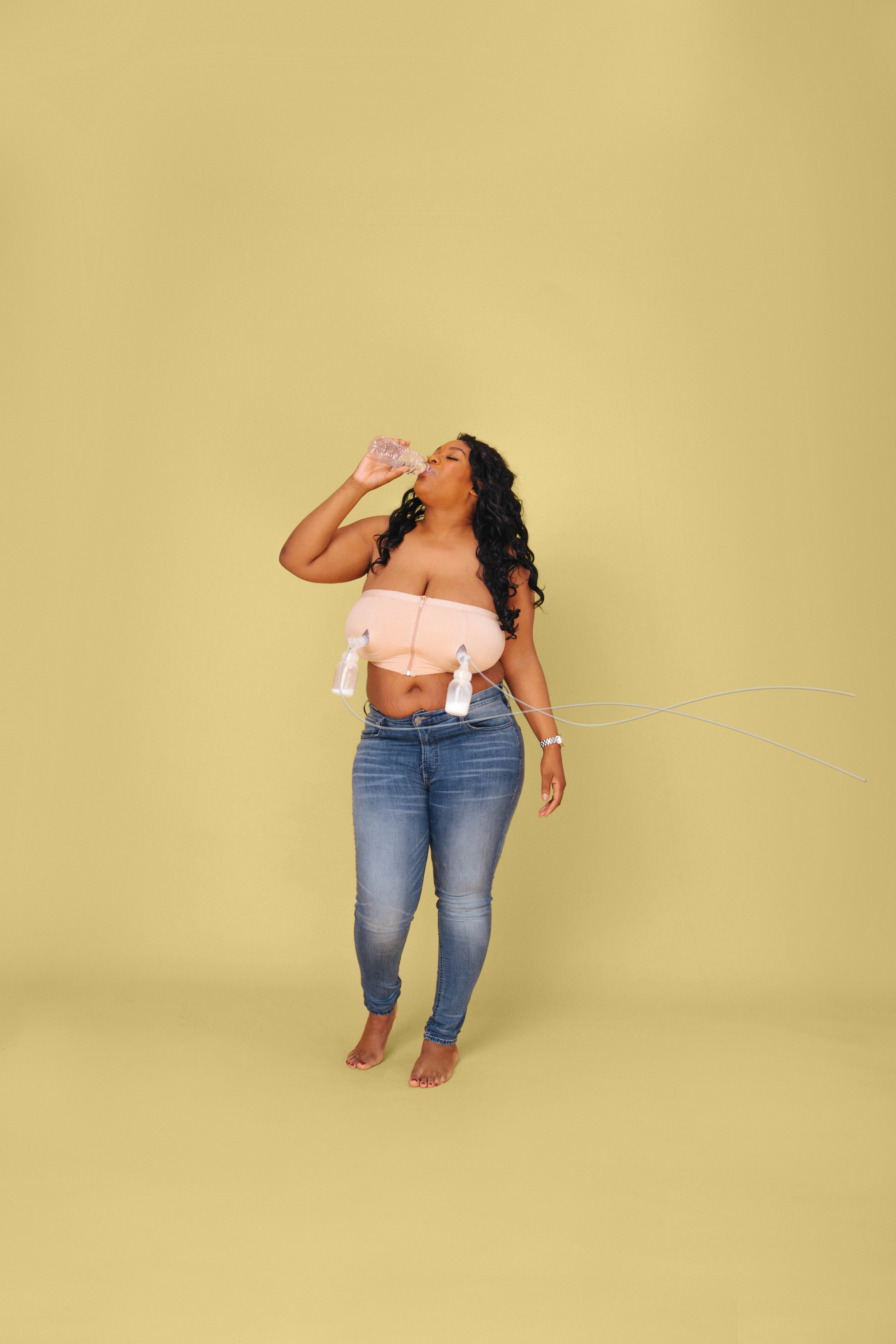


This might be the first time she is away from the baby, so we wanted to create something that had empowering messaging. We also wanted to stand out in the marketplace among other mom and baby products, and for the mom to feel like she was getting pampered.
PACKAGING
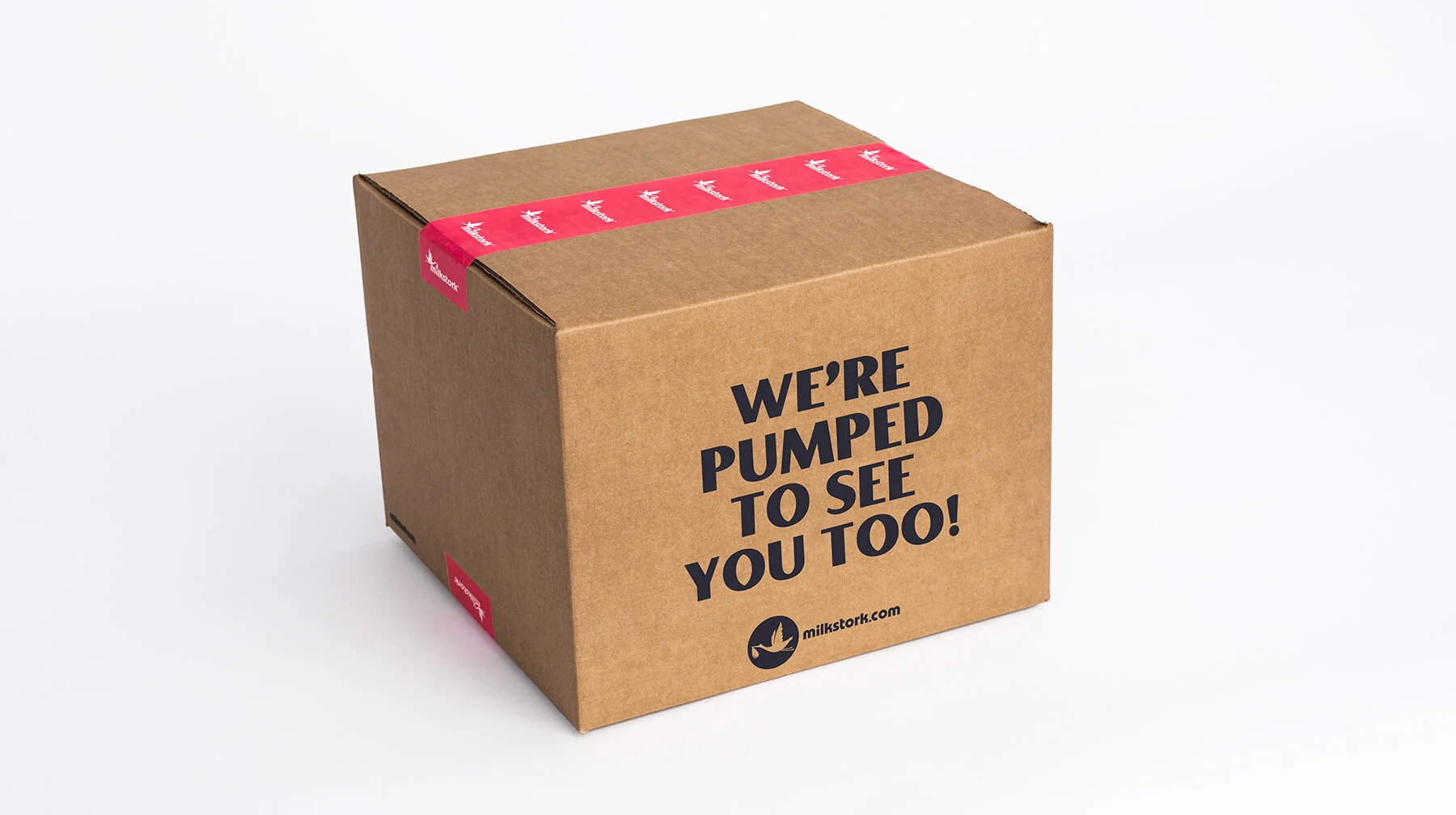
The packaging feels premium yet approachable featuring big, bold, clever text that speaks to her. We replaced white boxes with Kraft to avoid scuff and our brand colors allow for an elevated look and feel.
BOX TO MOM
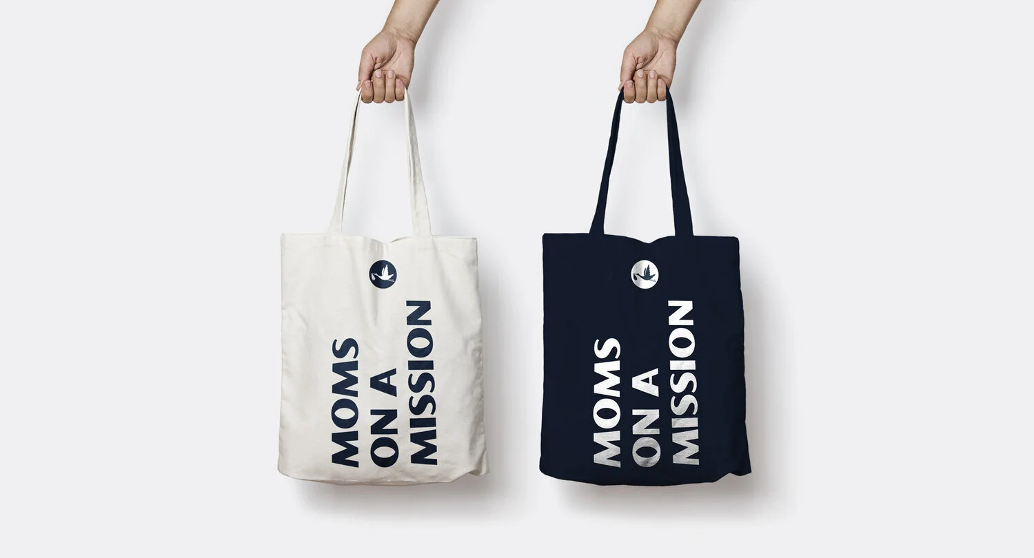
The tote is a badge of honor. Something moms are proud to wear not just through the airport but also grocery shopping and beyond.
TOTE BAG

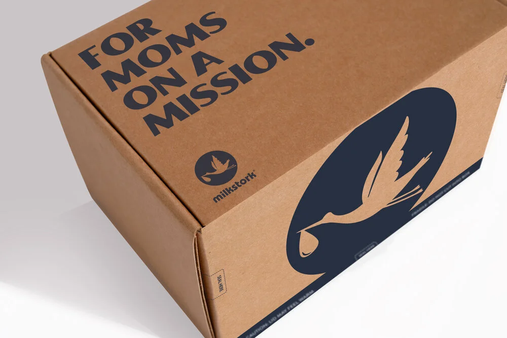
BOX TO BABY
The big blue stork on the side of the box became our signature and carries through to other products. The pink stork stickers add a fun and inviting element.
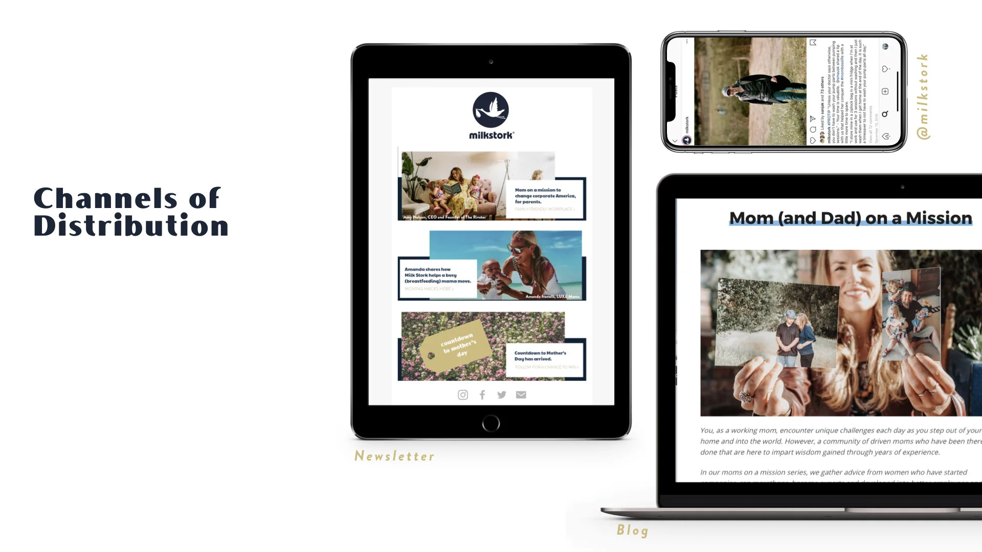
WEBSITE
We redesigned the website, adopting the brand’s new look and feel while optimizing every page to work harder to create interest in the products. All this while making our target consumer fall in love with the brand via strong creative that speaks to the modern mom. We know that information overload can hamper moms’ decision-making and leave them paralyzed, so we pared down the copy to lead with the most crucial information.
Our email strategy objectives were to generate awareness of Milk Stork’s mission and products, build trust through relevant and engaging content, and make moms fall in love with the brand. To achieve those goals, we created a content blend that included helpful/informative, humorous, and timely content that our community could share and engage with. We applied this strategy to newsletters, welcome, and post-purchase funnels.
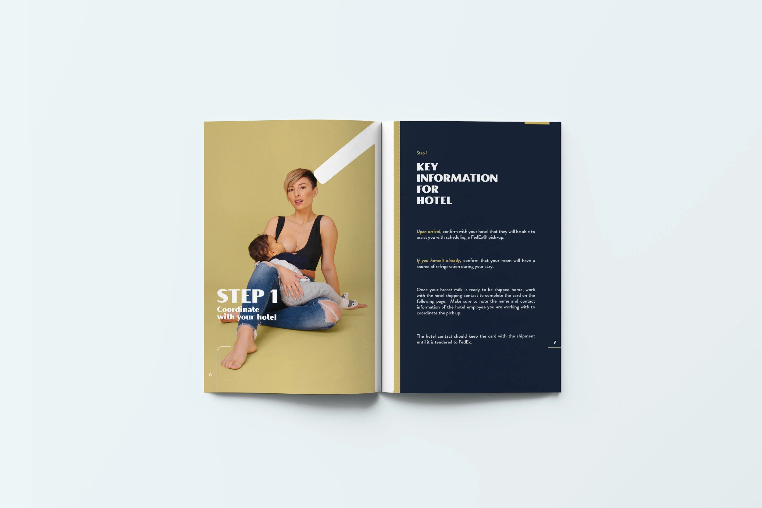
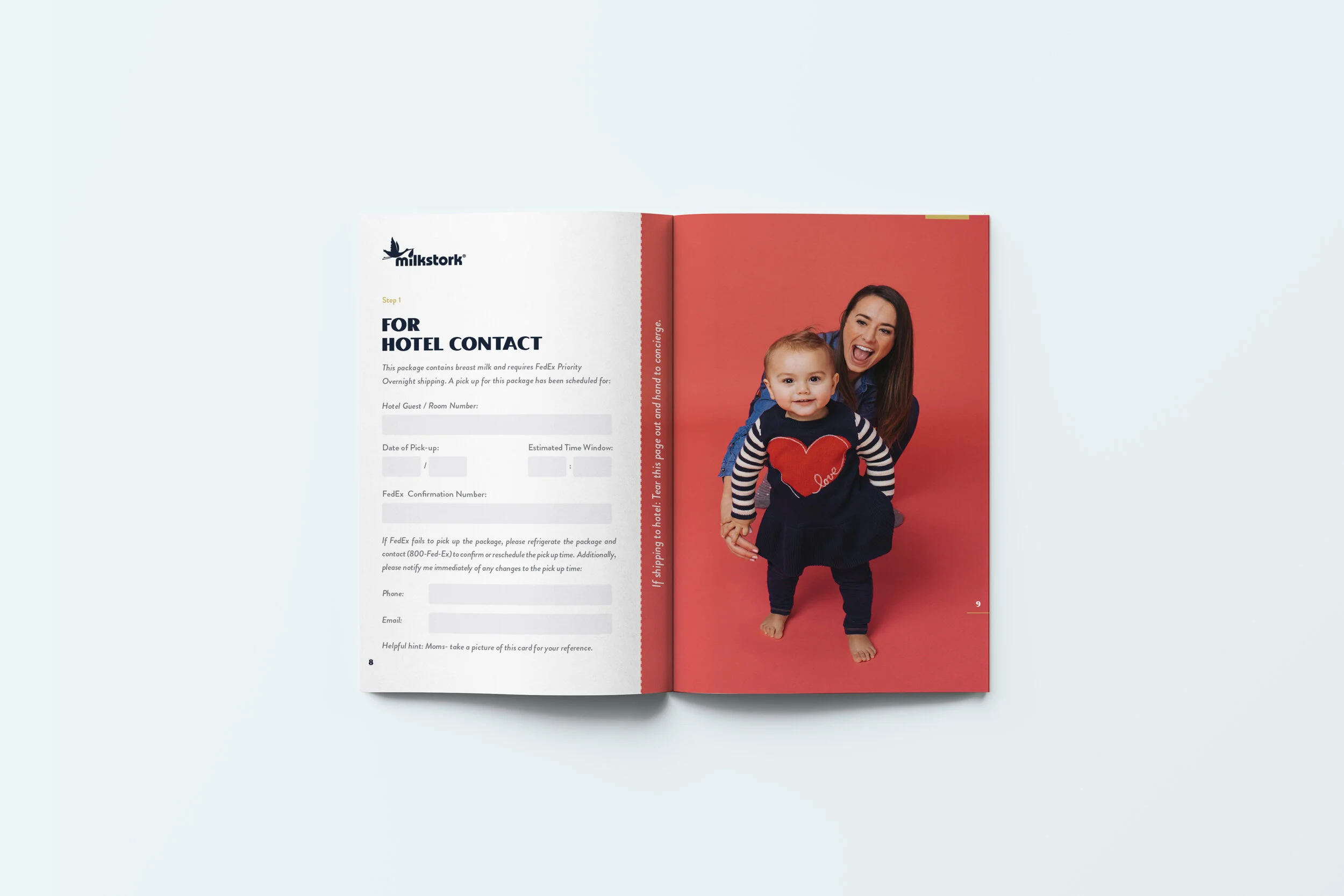
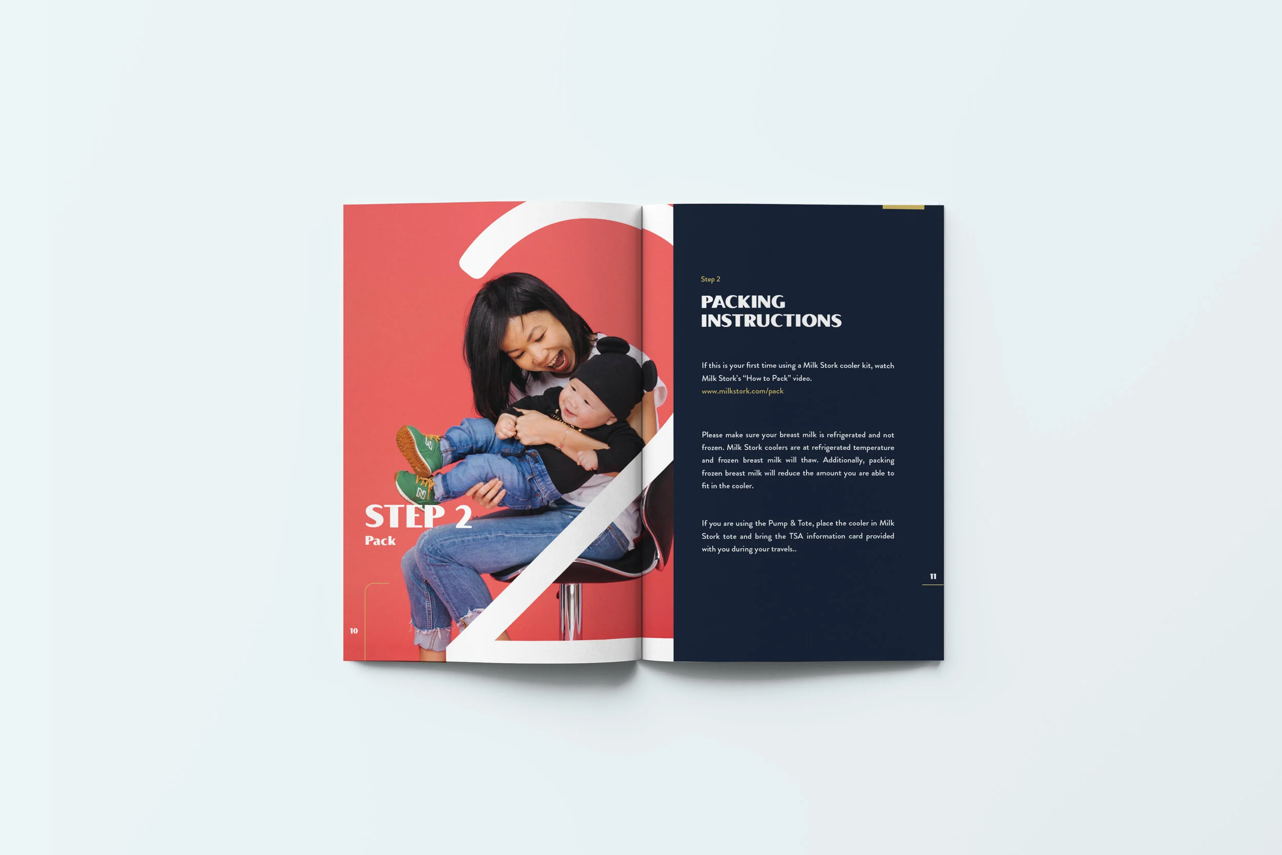
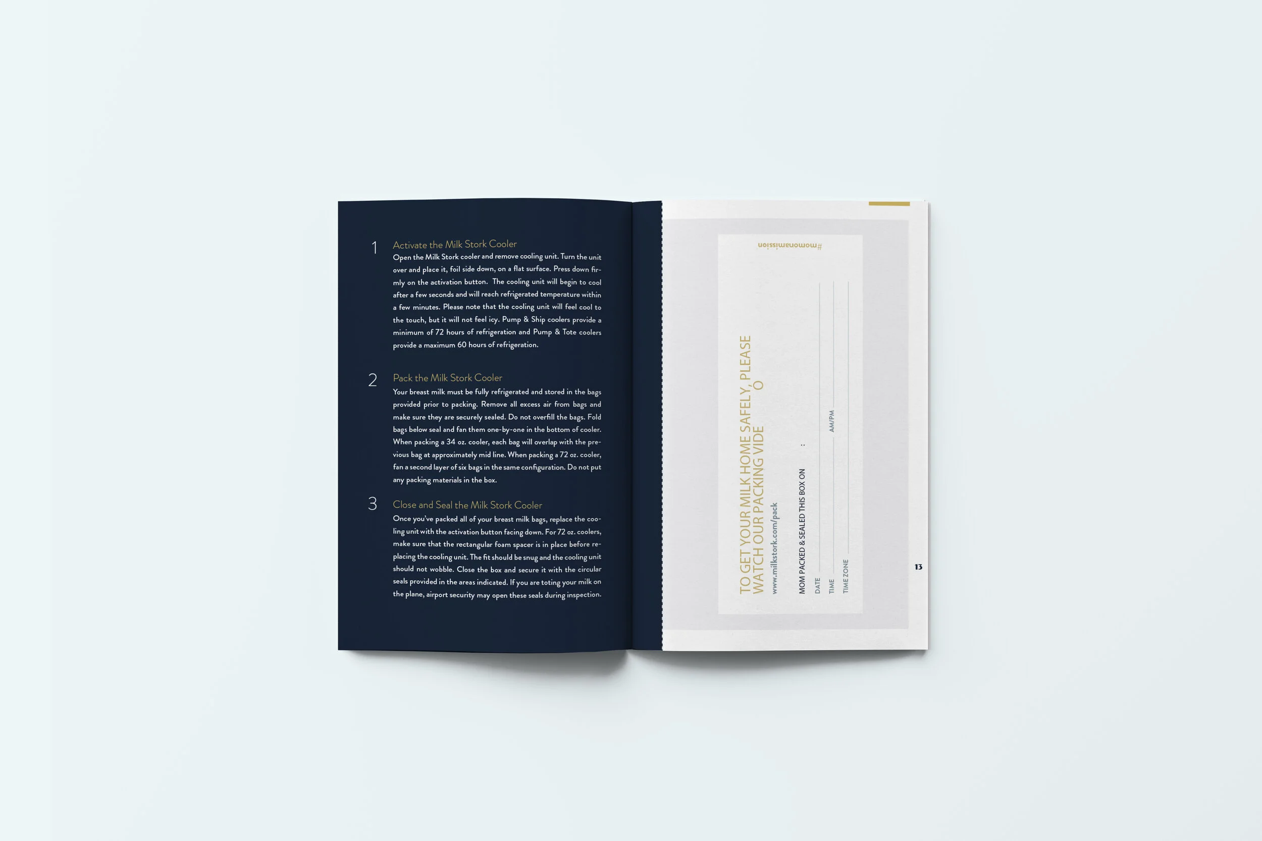
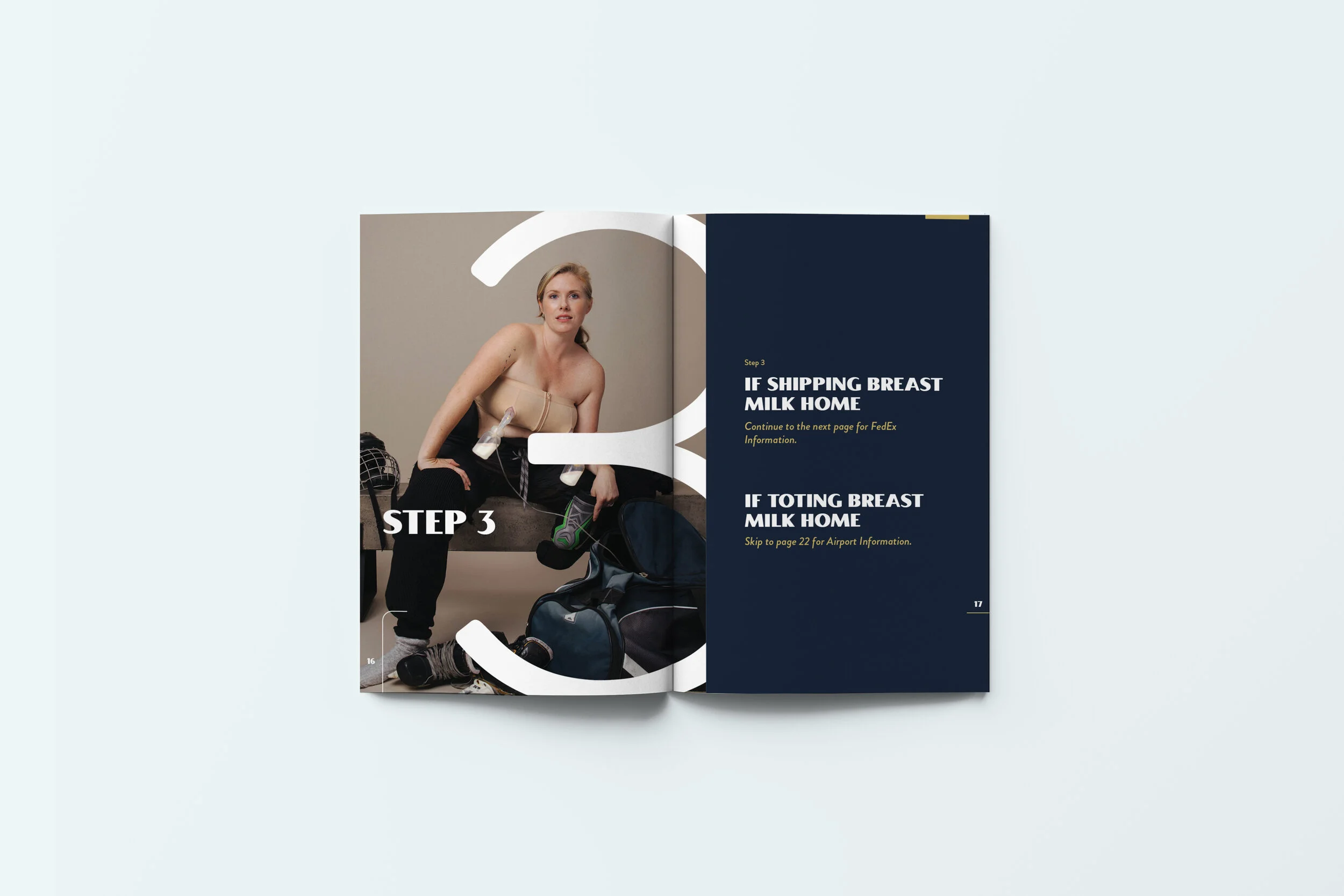
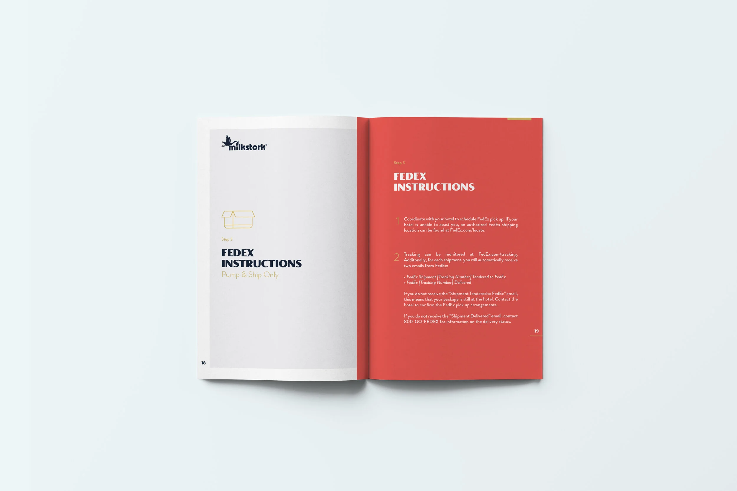
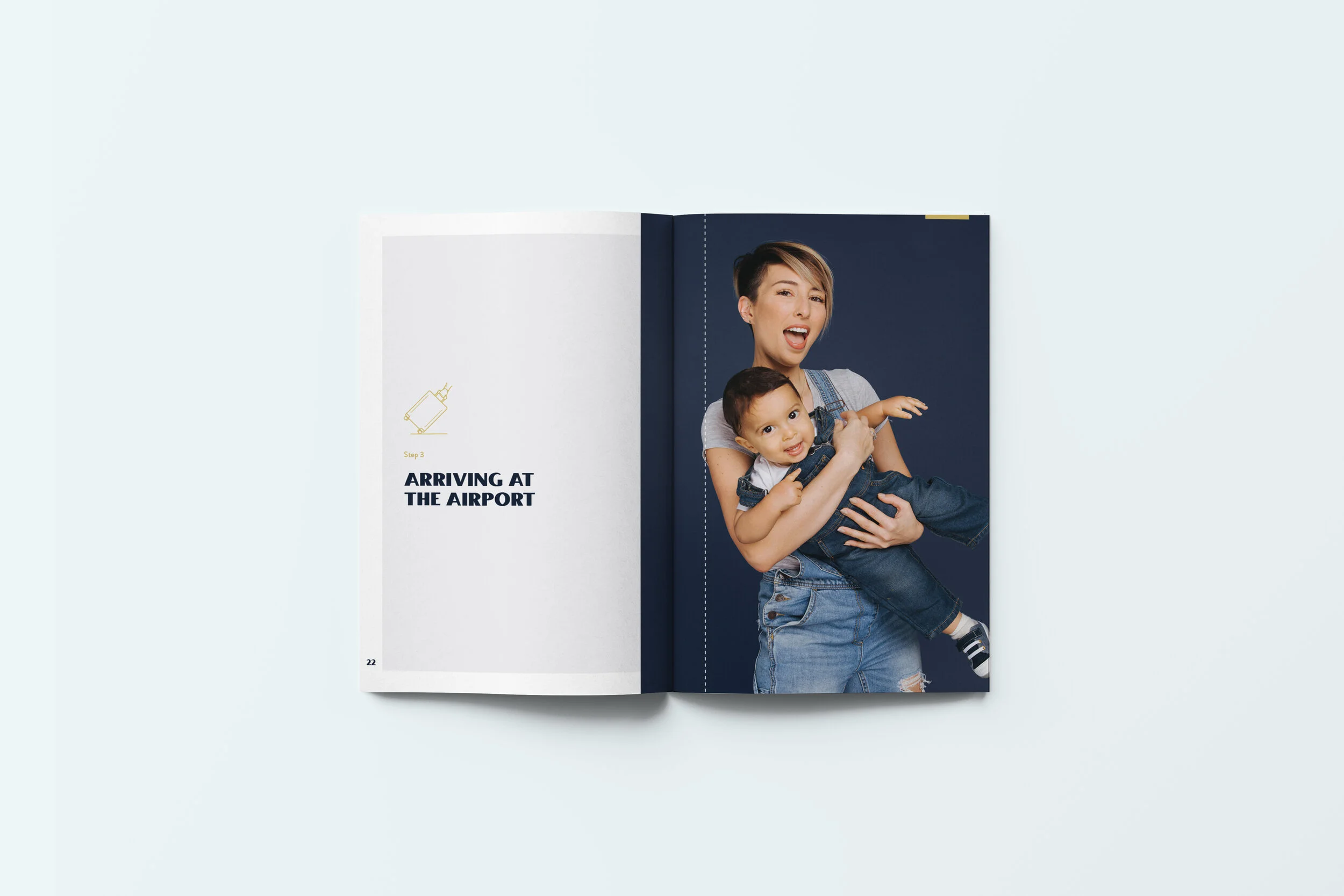
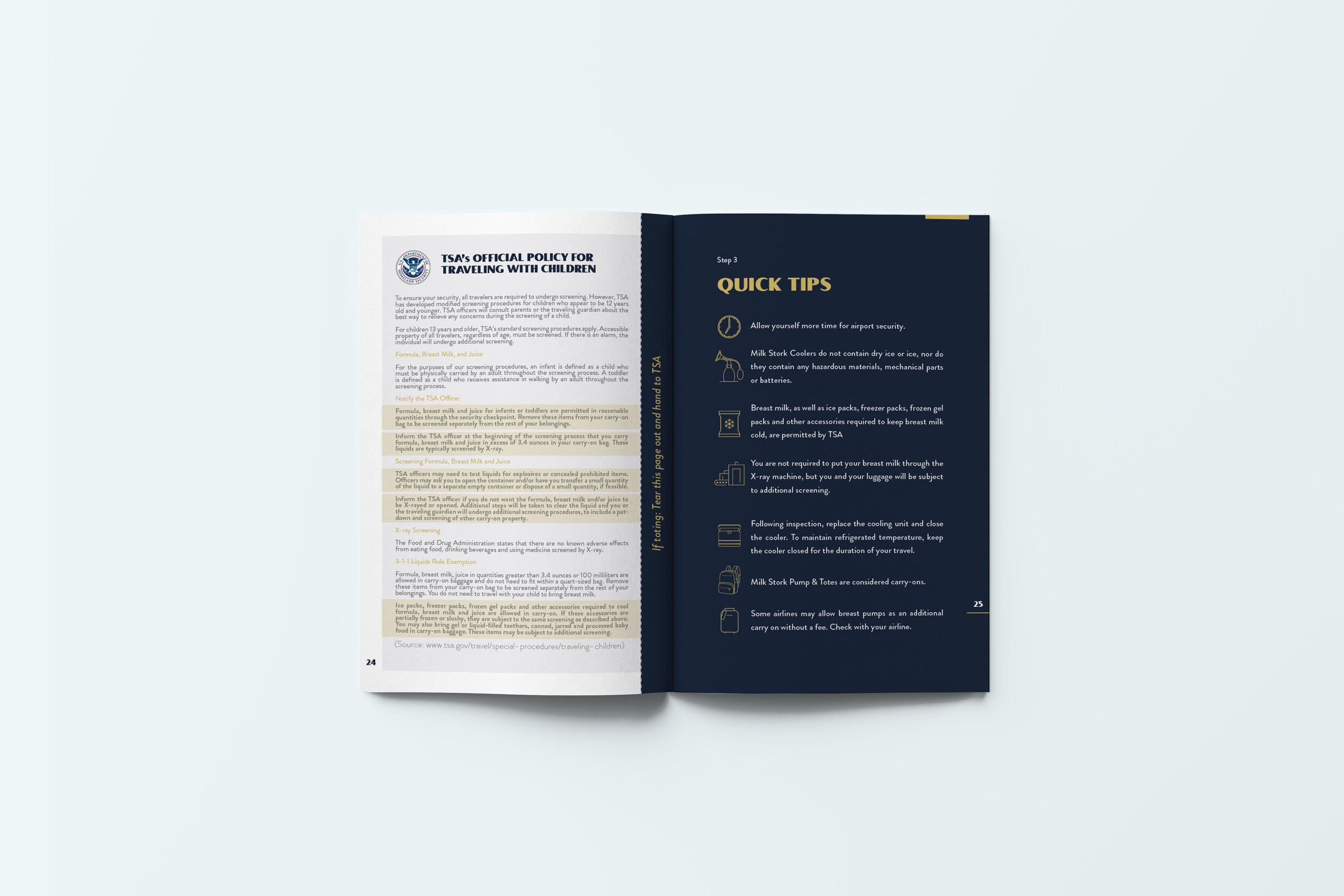
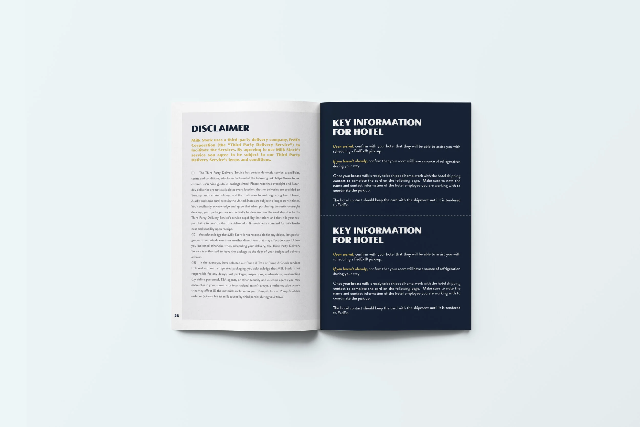
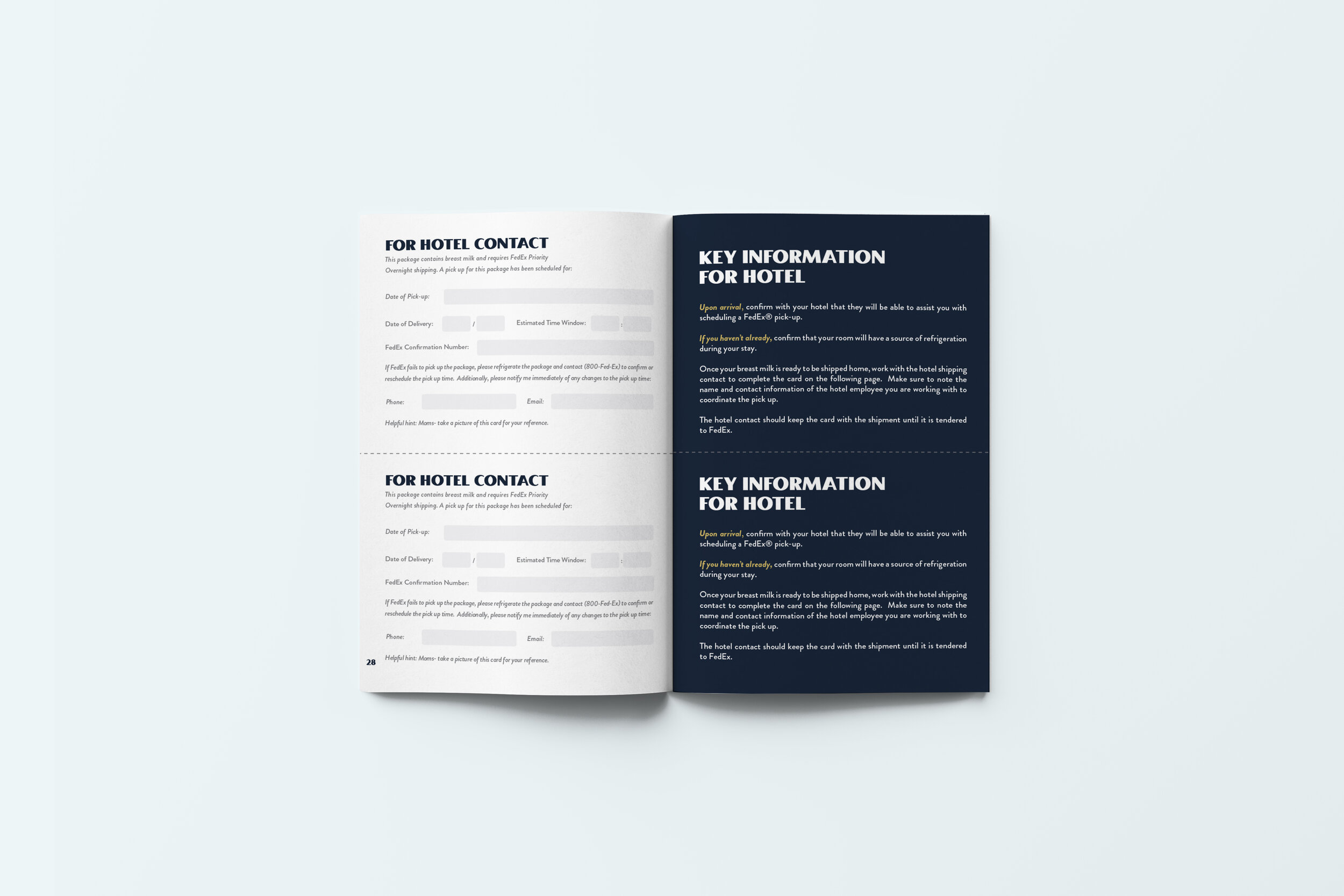
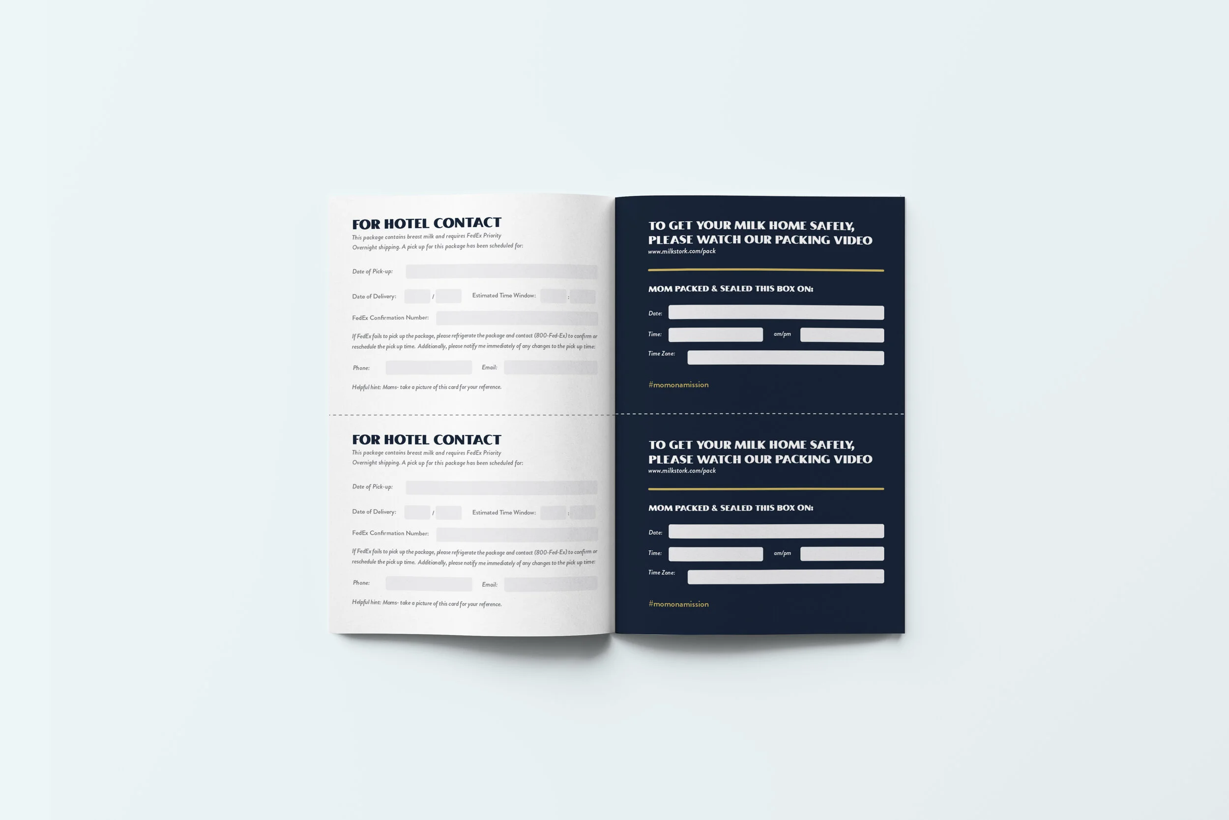
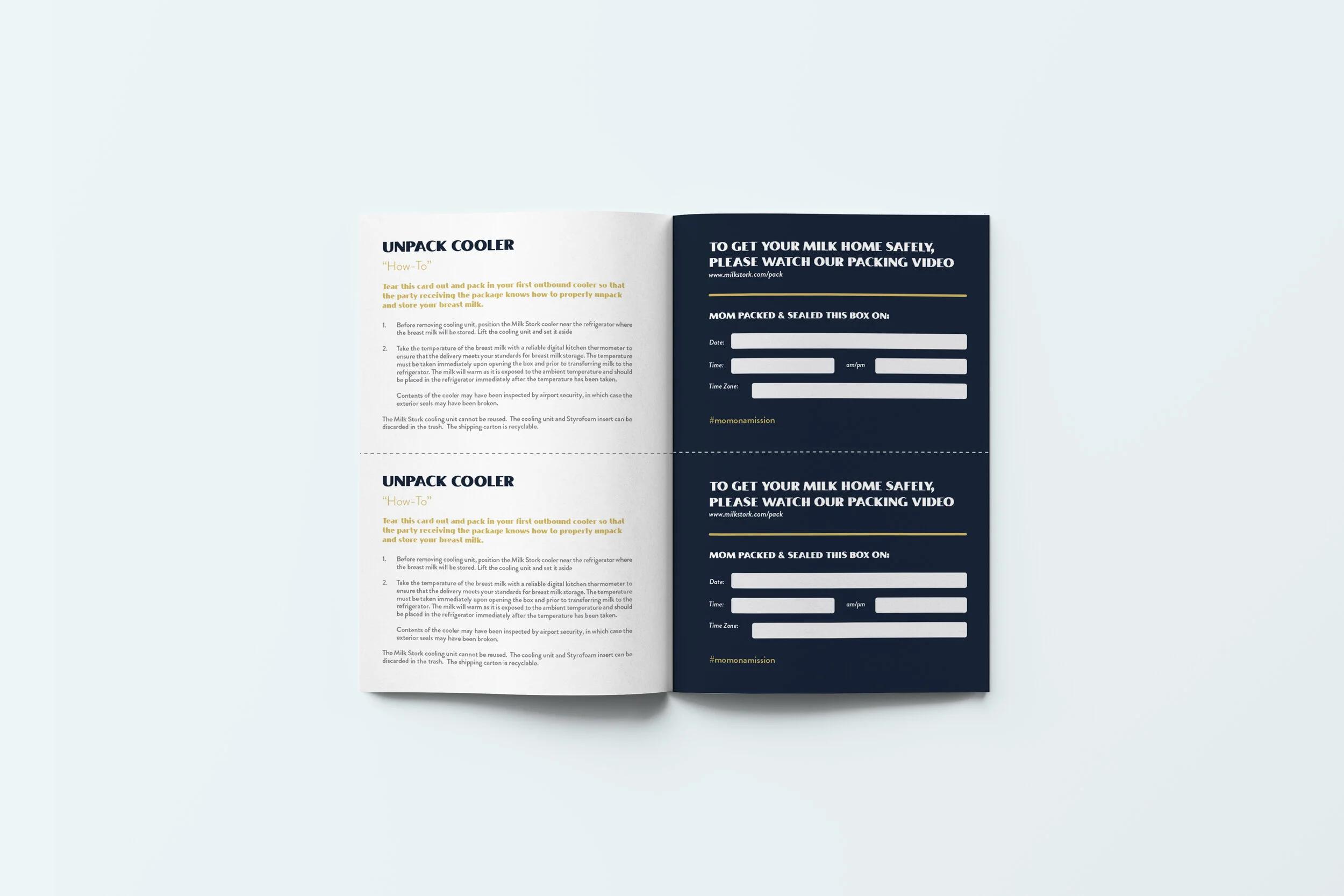
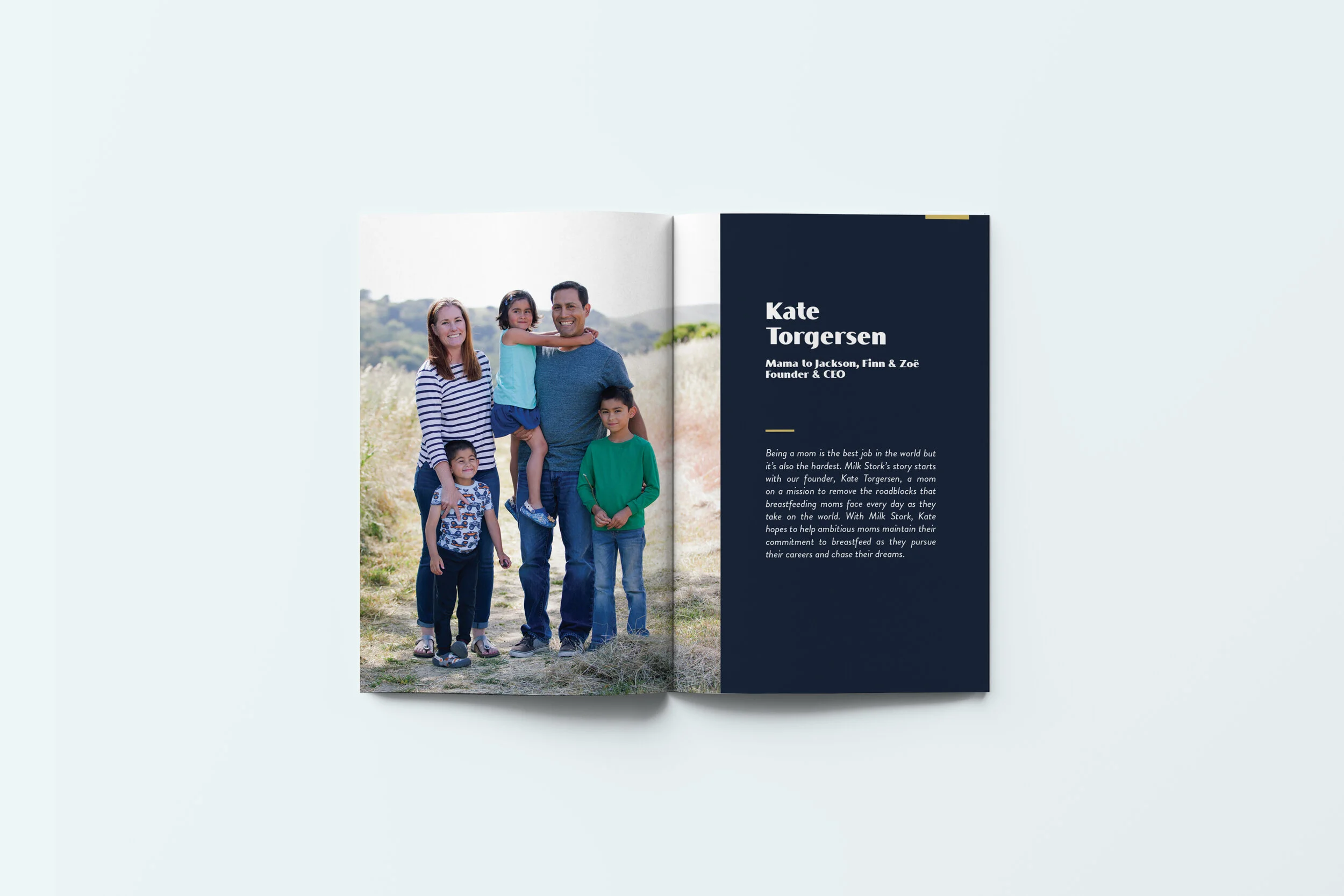
INSTRUCTION MANUAL
The front of the instruction manual is gold (and reflective), as we are shipping moms’ liquid gold. Inside the manual we feature many different kinds of moms, our brand story, and Milk Stork’s manifesto.
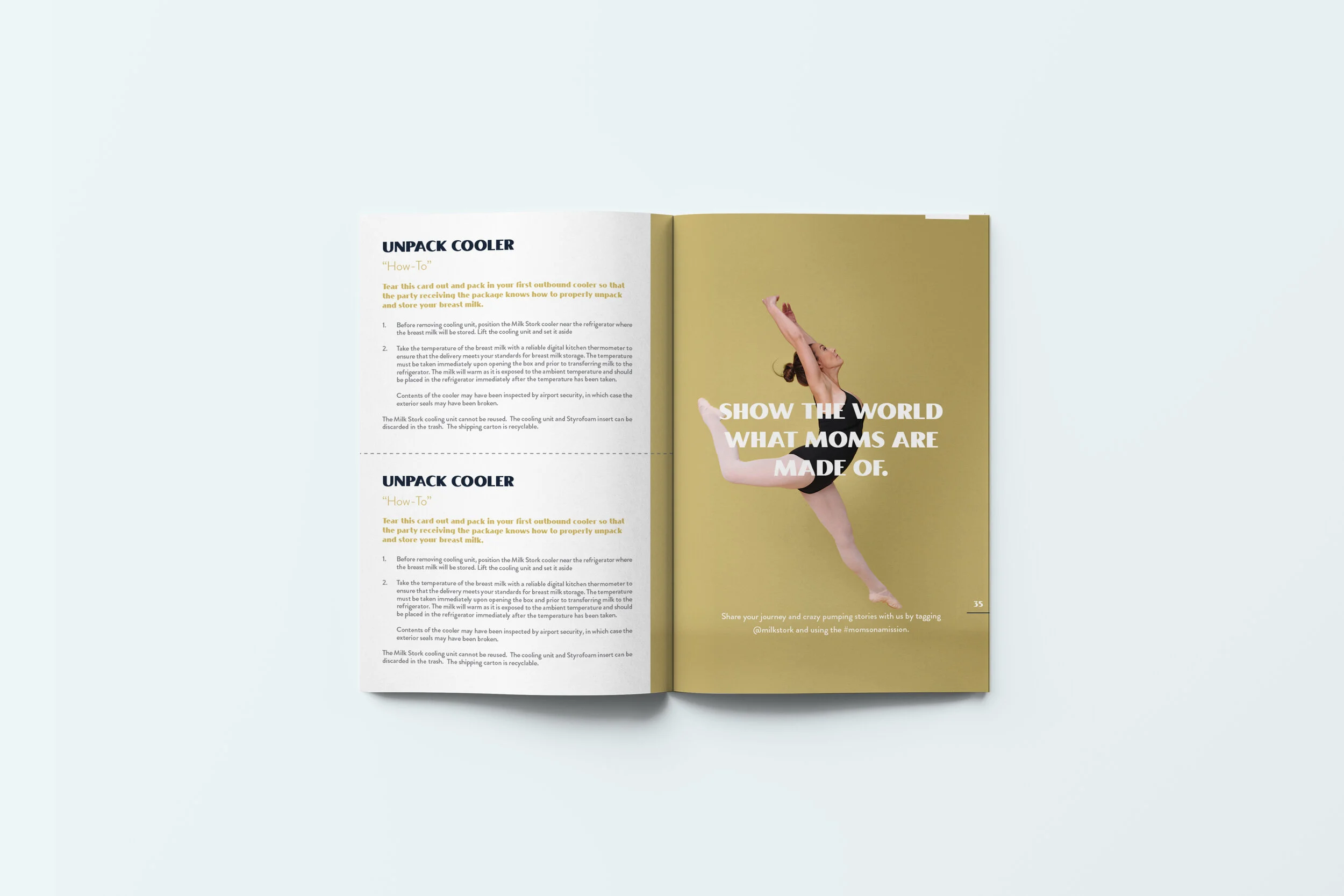
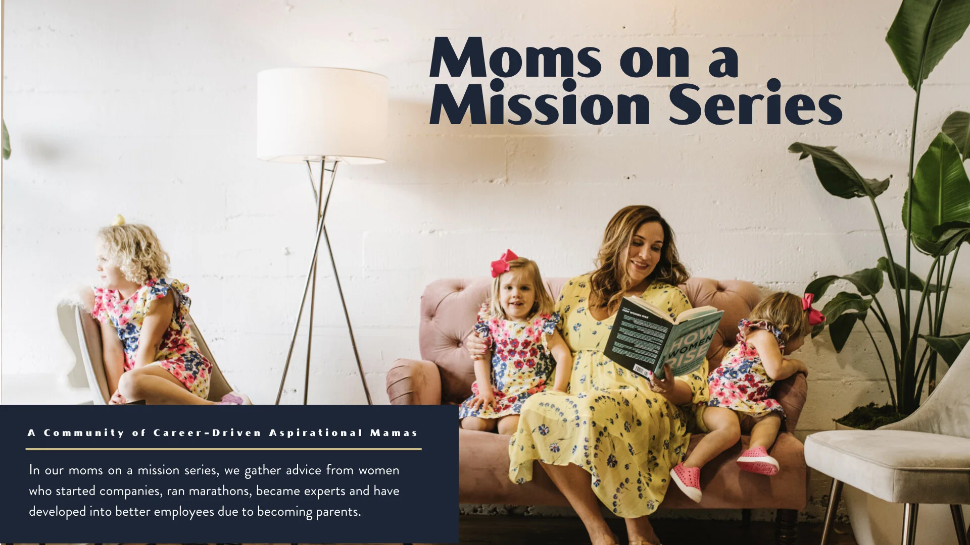
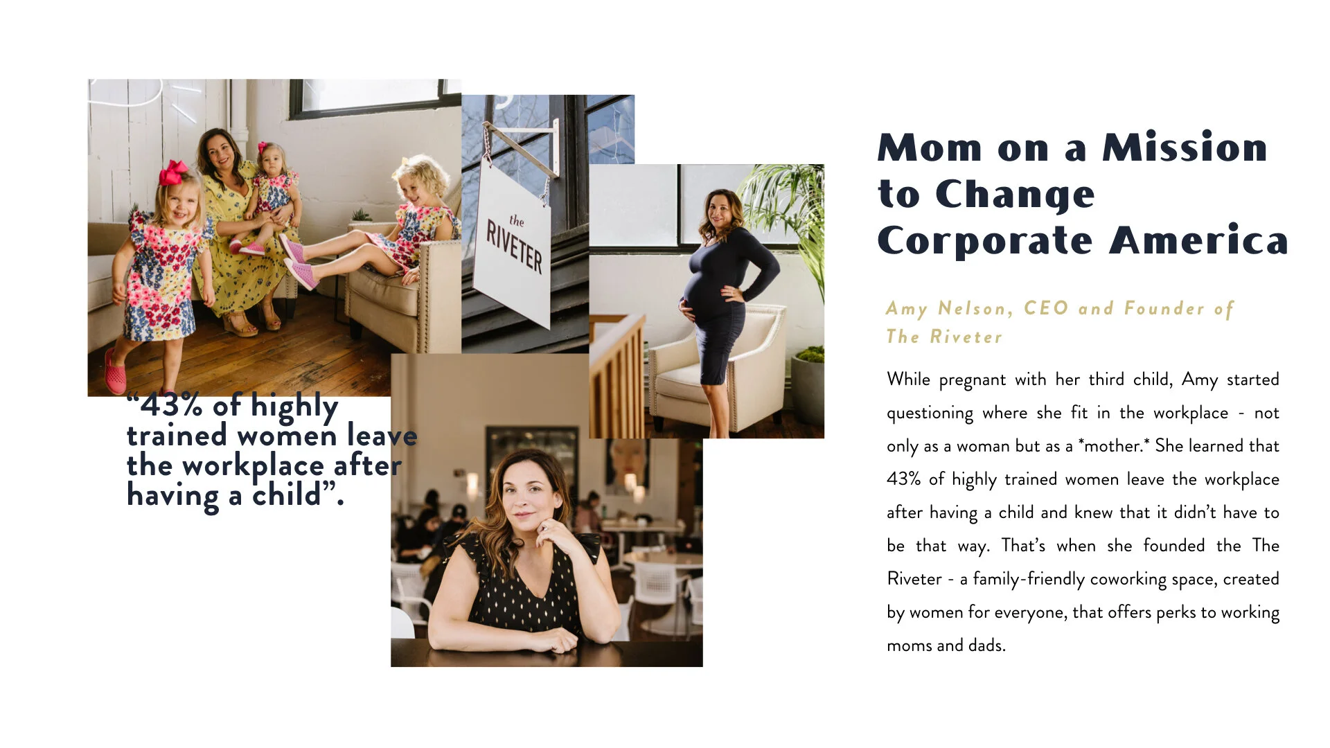
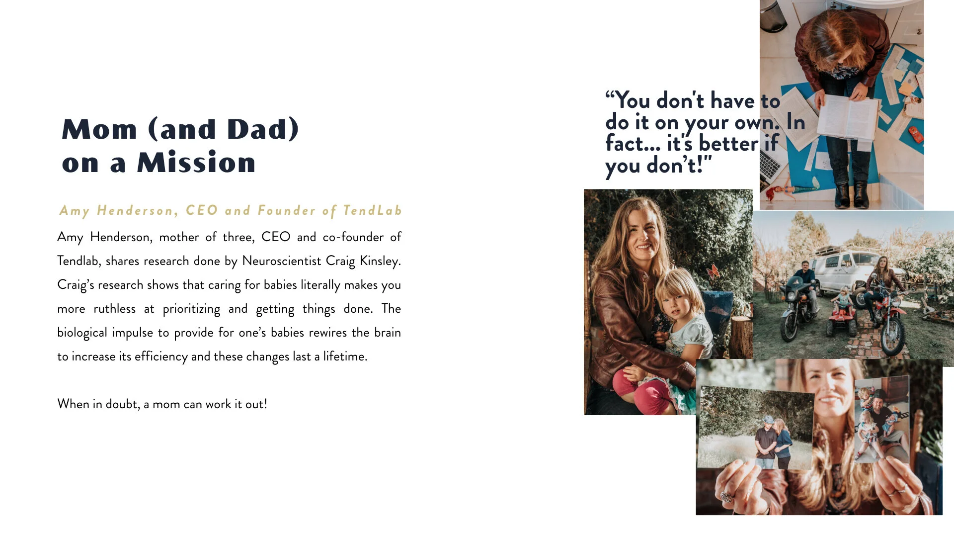
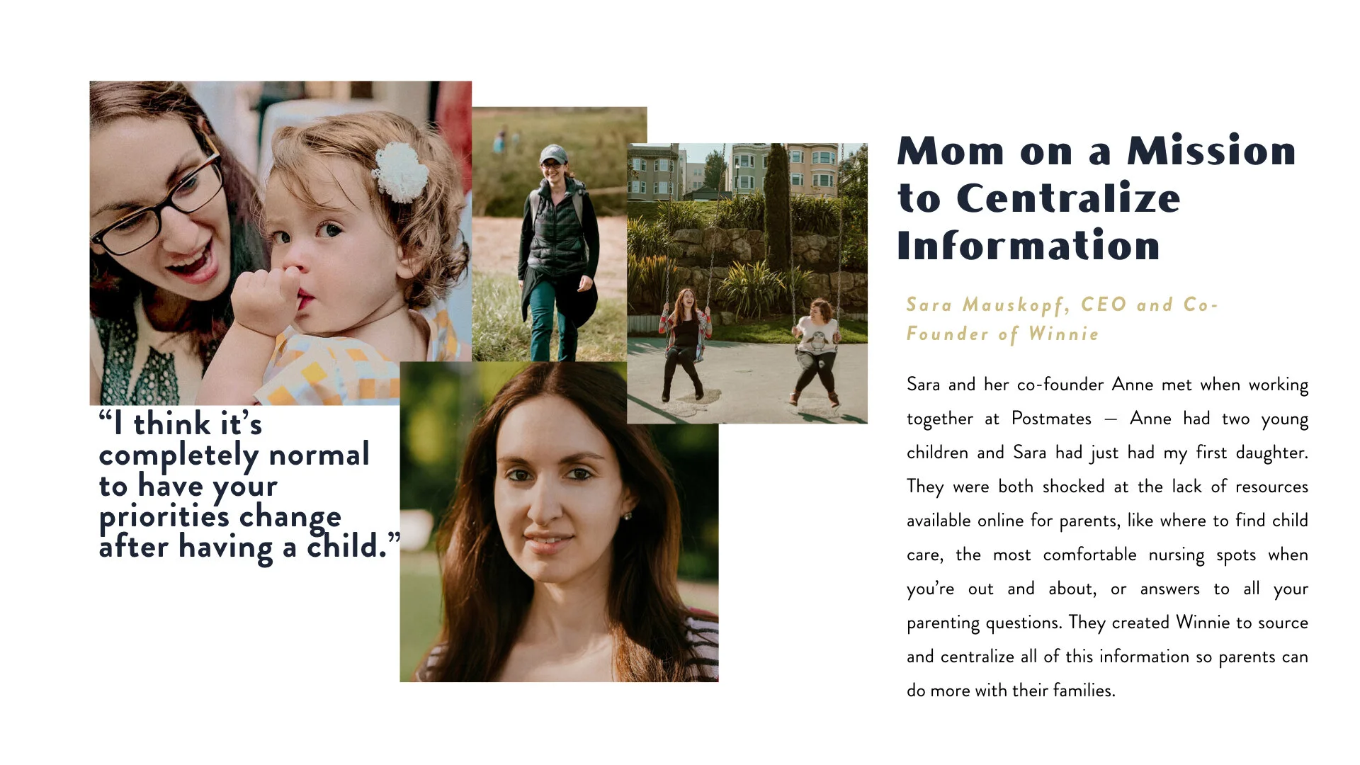
BRAND CAMPAIGN
As a brand campaign, we created a Mom on a Mission platform that features inspiring women who have successfully and unapologetically juggled their careers, interests, and families. Working moms encounter unique challenges each and every day as they step out of their homes and into the world. For Milk Stork, we developed a community of driven, passionate, and involved moms who constantly share new perspectives on what it is to be a mom doing it all.