
What We Did
In the world of sports, chemistry is everything. It takes a focused team composed of complementary pieces working towards a common goal. Nobody understands this game like ALIGND, a Los Angeles-based sports agency that is built for the player. They came to ONA for a one-of-a-kind, unique brand identity in the sports agency space.
Brand Identity
Logo
Colors
Social
Website


Is advocacy.
Is authenticity.
Has one agenda: Player above all.
Embraces the future of sports representation.
Educates Players and defends their interests everywhere.
Operates in lockstep with the goals and priorities of our Players and their families.
Blends decades of success with a fresh re-imagining of what an Agency’s priorities should be.
Focuses on our strength of providing guidance at each stage of our Players’ careers.
Promotes a positive, supportive and inclusive culture.
Negotiates fearlessly and achieves results.
Succeeds when our Players succeed.
Is partnership.
Is confidence.
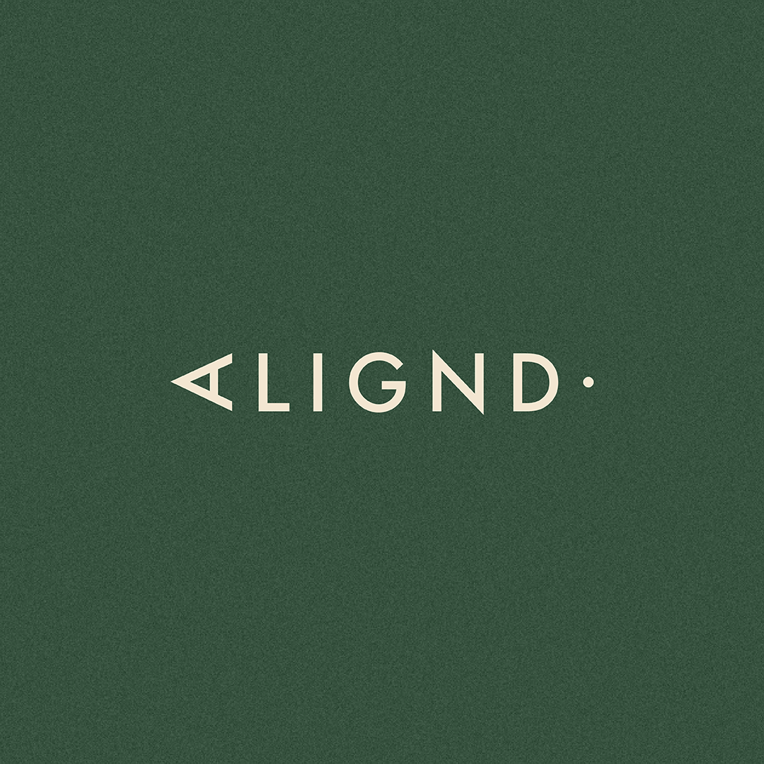
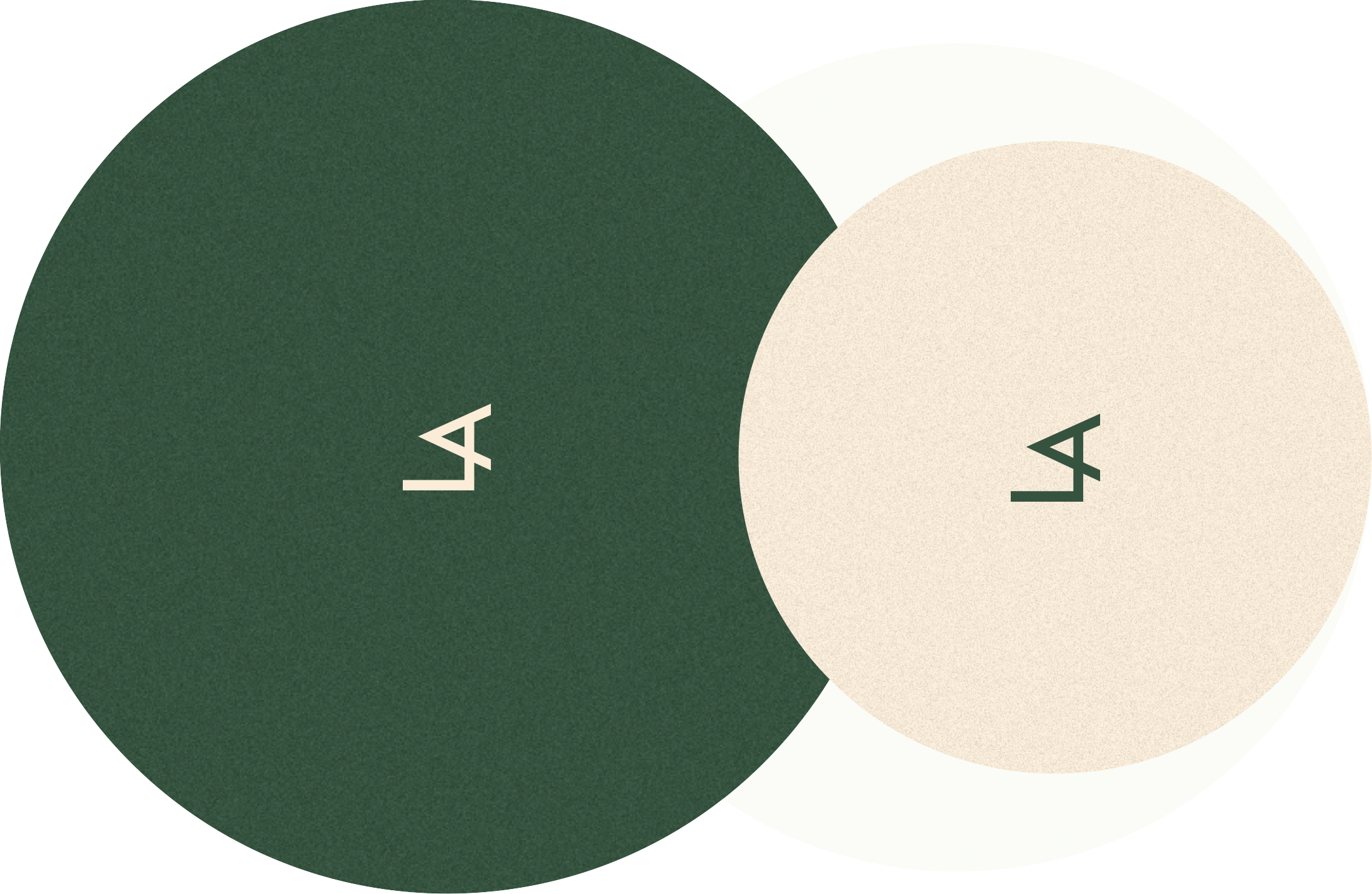
LOGO
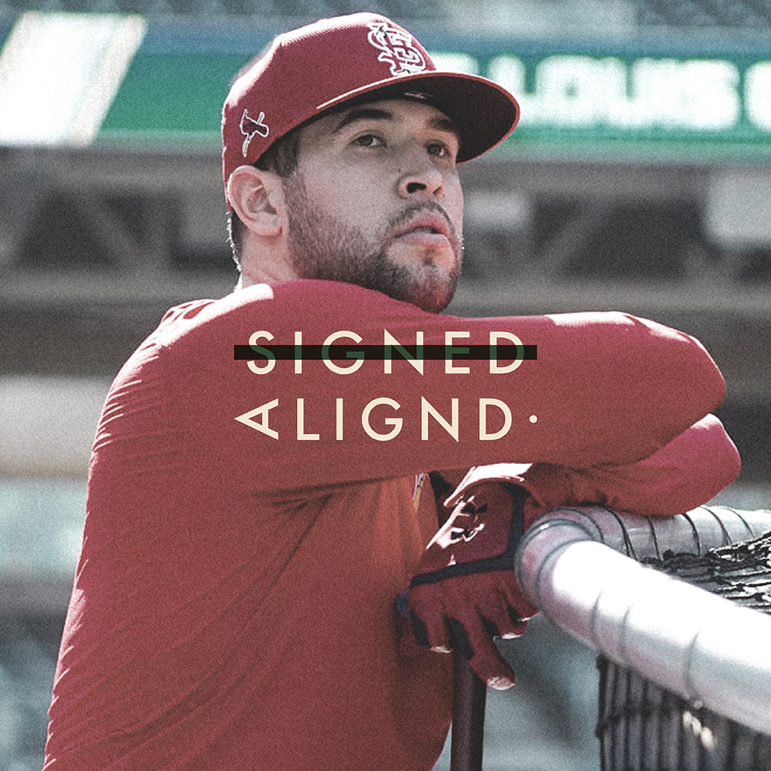
ALIGND is a custom-made typeface to reflect the value of the player. The logomark of the A at 90 degrees angle showcases a greater than sign, signifying that for Alignd, the athlete’s desires always come before the agency’s business opportunities.

COLORS
The dark green is the color of money and reminiscent of a sports field. The cream color comes from old scorecards and newspapers, and from the yellowing of the sole of an old sneaker.

Textures
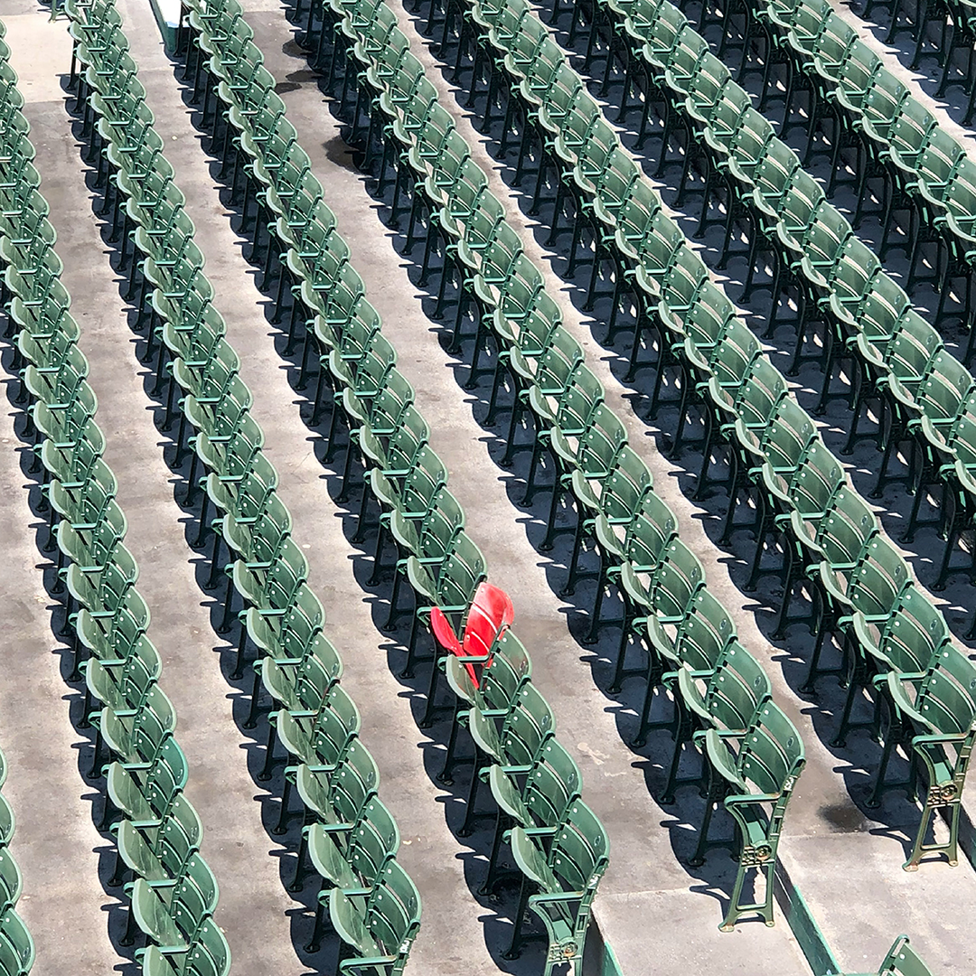
The grain texture not only nods to the vintage roots of baseball but contributes to a unique, nostalgic look and feel that stands out against competitors. Framed by clean lines, the texture balances sophistication with the grit of baseball.
SOCIAL