

Lettuce Grow
Farm(stand) to table
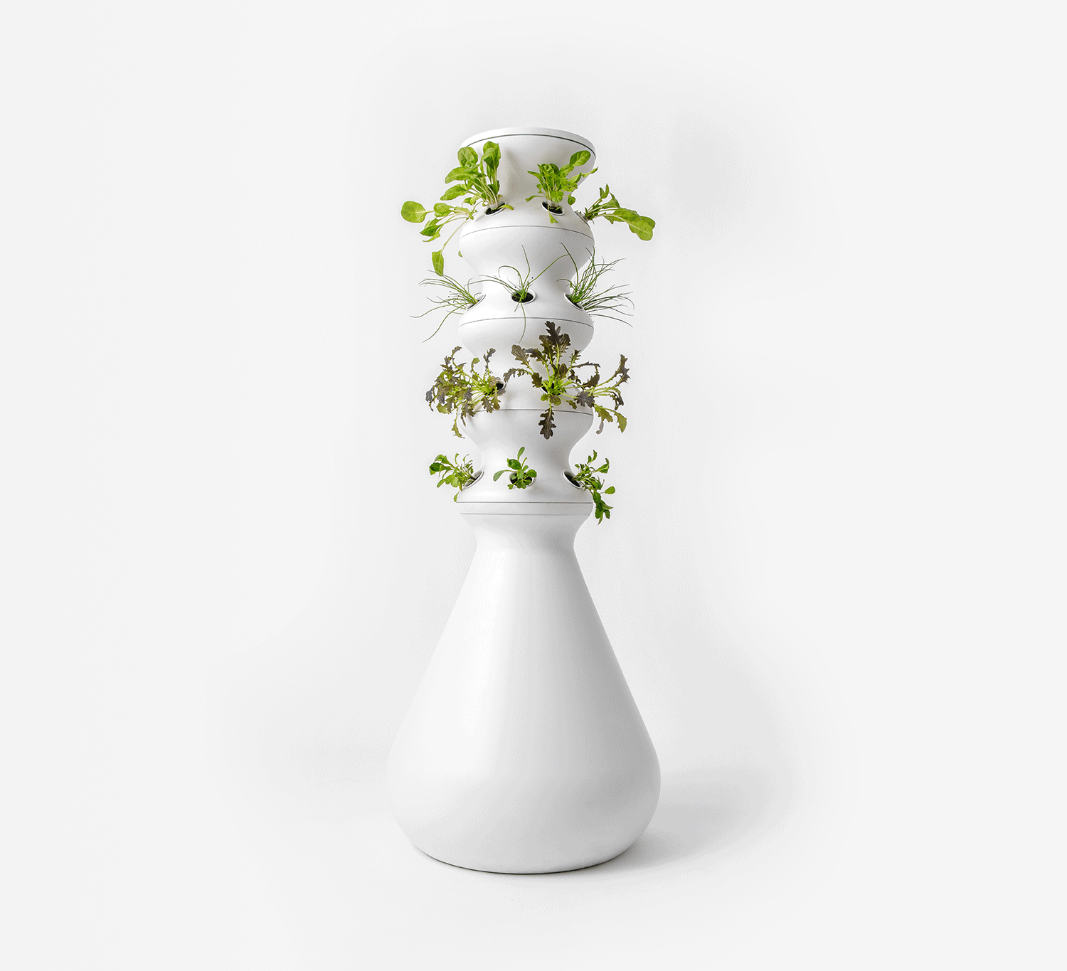
Lettuce Grow launched a sleek, revolutionary hydroponic system that makes growing food from home accessible to the modern lifestyle. However, their branding showcased the Farmstand product as just another gadget for gardening enthusiasts. We repositioned the Lettuce Grow brand to reflect its premium product, price point, and “non-gardener” target consumer.
Marketing Plan
Art Direction
Content Creation
Packaging Design
Brand Strategy
Brand Identity
Key Messaging
Website

WEBSITE
First month-over-month changes

Increase in conversion rate

Decrease in bounce rate

Increased pages per session

Avg. session duration

More transactions

SOCIAL
Six months of social management:

Follower growth(34.1k new followers)

Increase in engagement

Increase in Story views
Drove their biggest full-priced sales day to date with the Earth Day campaign (with no sales or discounts applied)
We repositioned the Lettuce Grow brand in a way that not only reflects the premium quality and functionality of the product, but also drives home the brand’s core values and key messages, which encourage people to lead healthier, more sustainable lives. Simultaneously, by highlighting these core values, we positioned Lettuce Grow squarely at the target consumer intersection of food, wellness, and sustainability. Through the brand strategy and brand identity, Lettuce Grow has evolved into a brand that makes the "growing your own food" lifestyle accessible, appealing, and shareable.
BRAND STRATEGY


The Lettuce Grow brand mark represents the cycle of growing food on the Farmstand, while the hidden triangle suggests a strong foundation, upward movement, and a nod to the food pyramid. The Lettuce Grow wordmark is used as the primary logo in combination with the brand mark when the opportunity permits. The curved crossbars in the letter E create a unique and iconic look, connect to the brand mark, and give a nod to growth.
logos


The new color palette was inspired by the colors and textures found in nature, specifically those found on a farm. Primary colors of recycled white, natural black, and kale are the core brand colors to be used when introducing the brand and prominently thereafter. A mixture of earth tones juxtaposed with a touch of bright colors. Off-white and off-black because there is no such thing as pure white or pure black in nature.
The secondary color palette was inspired by some of the brighter fruits and veggies grown on the Farmstand. Secondary colors are intended to be used very sparingly to add an element of playfulness to the otherwise muted color palette.
COLORS


Consistent use of typography allows consumers to immediately recognize any brand, and Lettuce Grow is no different. We selected Rubik as the primary typeface for the Lettuce Grow brand. Rubik's simple and geometric features embody the modern aesthetic we wanted to achieve. Source Serif was chosen as the secondary typeface. It is a classic sans serif font that softens the brand and creates a sense of class.
TYPOGRAPHY


All of the icons were hand-drawn to carry on the same elegant, minimalistic visual language as the brand mark. Futuristic, yet approachable. Clean lines reflect the premium look and feel of the rebrand.
ICONS

The website was redesigned with simplicity and premium quality in mind. Wanting the viewer to know and understand the ease of the Lettuce Grow Farmstand. As the consumer scrolls through the site we break down every potential buying barrier to present this beautiful system. In the first month after the launch of the new website, Lettuce Grow saw a 15% conversion-rate increase.
WEBSITE

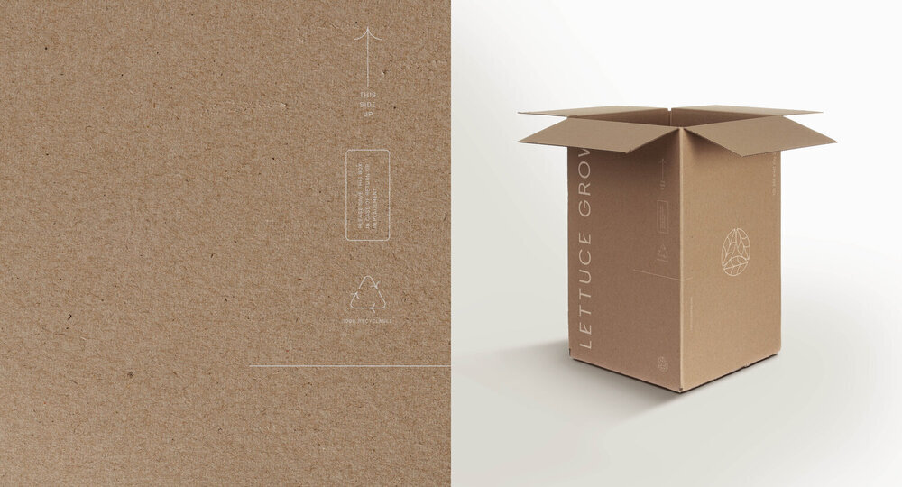
Understanding that the product itself was forward-thinking and beautifully designed, we wanted to create a thoughtful, timeless, and minimalistic brand. The packaging is a perfect expression of this efficiency, featuring the brandmark on one side and the wordmark on the other.
PACKAGING
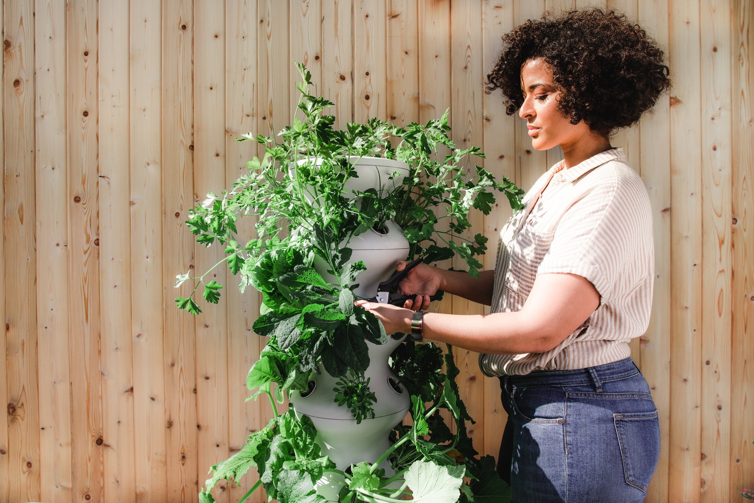
The photography captures conscious modern people and families living the “grow your own” lifestyle. Gray and white tones are emphasized, with pops of green coming from vegetables. Sleek and modern aesthetics are complemented by organic raw materials including stone, wood, and concrete.
PHOTOGRAPHY


The social strategy and content evolution reflected the aesthetics of the rebrand, creating a clean, premium look and feel. The content educates, encourages, and engages the active Lettuce Grow community. Everything from social icons to testimonials was thought out, custom designed and executed with the brand in mind.
Dive deeper into the social growth strategy we achieved in action:
social


We redesigned the newsletter and built out the welcome and post-purchase drips with conversion in mind.


